Believe it or not, mobile web design is only about four years old; in those four years, mobile has evolved dramatically and become a critical component of the marketing mix.
Mobile is not just for big brands, it is also important for small businesses to create a strategy for how their website functions in the mobile space.
As a small-business marketing agency, we want to see our clients benefit from the same tools and technologies of their larger competitors. Below we have outlined our top three tips on how to make your small business mobile site convey your message accurately and effectively.
1. Define Your Business Objectives
Unlike your website, there is limited space when you move to a mobile device so it is very important to define a couple of top priorities to convey to smart phone users.
Example: Cartridge World
Primary business objective: Saving money on ink and toner cartridges
The leading message conveyed on the Cartridge World website and mobile site is the same: Save Money on Ink and Toner Cartridges. On the corporate website there is more real estate to convey that message and offer interaction points to allow the visitor to experience the savings for themselves.
On the mobile site, you don’t see the complex navigation and other callouts, but the primary business objective is perfectly conveyed. Visitors are not bombarded with too many messages, they are offered one message: Save 30-40% on Ink and Toner Cartridges; and offered two large touch-targets: Find a Store, Calculate Savings. It can’t get much more efficient than that: where you can buy, how much you’ll save.
2. Create a Simple and Unique Mobile Canvas
Don’t make things too complex on mobile unshackle yourself from your web design past. When working with mobile design you are facing two major barriers: screen size and slower network speeds. Mobile design calls for a simplified approach to design, layout, and navigation.
Example: Acumen
Primary business objective: To change the way the world tackles poverty

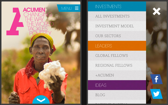
With less screen real estate at your disposal, you need to choose the placement of elements wisely. A single-column structure with collapsible navigation tends to work best. The single column allows the site to easily scale between different device resolutions and portrait vs. landscape mode. The collapsible navigation takes the single-column design a step further and allows your visitors to access the content they are most interested in.
Acumen uses simple yet strong visual elements to convey their message. The name, tagline and image are the only elements on the mobile landing page. The menu opens to a simplified version of the website’s navigation scheme. This design keeps the file size and load times down. They did a wonderful job of simplifying the message.
3. Provide a Lighting-fast, Exceptional User Experience
Users expect a faster experience on mobile than on a desktop. Mobile offers so many more capabilities to create that immediate, custom-tailored user experiences, such as multi-touch and location detection.
Example: Yahoo!
Primary business objective: connect people to their passions, their communities, and the world’s knowledge
 Via their mobile site, Yahoo does a great job at connecting their visitors to their passions, communities and world news. The single column, three-tab collapsible navigation allows Yahoo to deliver a large amount of information quickly in a digestible format.
They have mastered the one-thumb navigation scheme their users can get to the information they want to read in about eight seconds and with a maximum of three taps and a swipe.
The Yahoo business model is based upon membership, but wisely they postpone signup and let people actually jump in and start using their service.
